Mobile apps are changing fast, and 2026 is shaping up to be one of the most interesting years yet. We’re seeing a shift toward designs that feel more personal, more fluid, and more expressive, all driven by better system intelligence and rising user expectations.
In this article we highlight the key trends we expect to see across the mobile landscape in 2026, based on emerging patterns already appearing in leading platforms and design systems.
1) Clear Visual Cues for AI-Generated Content
As AI becomes a standard part of apps, designers are introducing clearer ways for users to distinguish AI-generated or AI-assisted content. Gradients, soft glows, and dynamic colour shifts are increasingly used to frame AI output, giving it a recognisable visual identity.
The now familiar ‘sparkle’ icon and its variations, such as the magic wand or sparkly pencil tend to indicate that intelligent assistance and automated / generative creation is available. While the ‘sparkle’ alone is the most commonly used indicator, the ‘magic wand’ and ‘sparkly pencil’, and other variations of the sparkle, are associated with generative actions, and editing or inline AI actions.
By last year, Google products had more than 100 variations using the sparkle icon for AI actions, and the library is expanding.
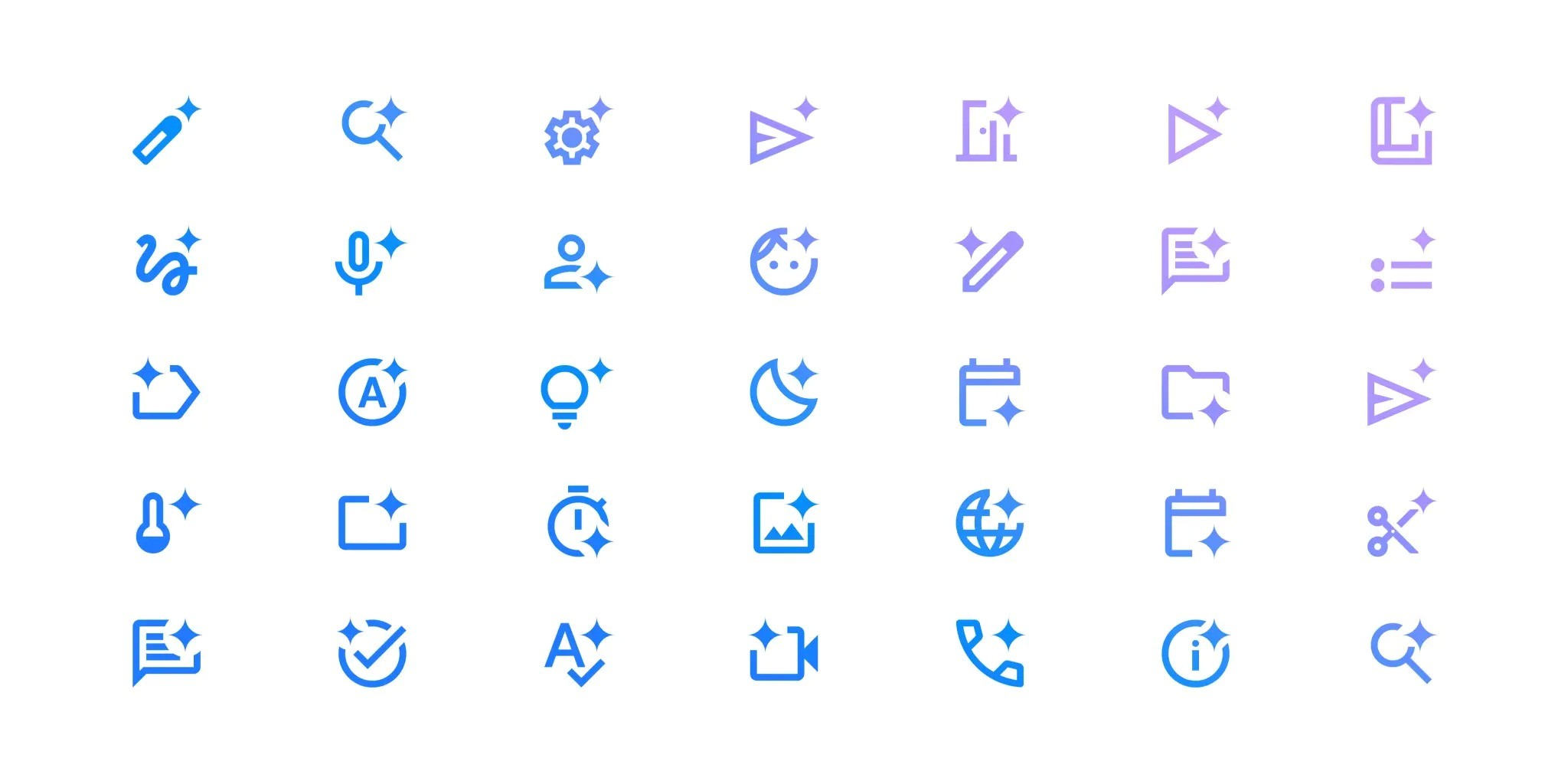
‘Sparkle’ icon used on Google products in more than 100 variations in association with AI tools (Source)
These cues go beyond decoration; it is intended to build trust and transparency. Making AI contributions visible, and distinguishable, helps users understand the source and the reliability of the information they are viewing. These visual cues display a sense of honesty and control, ensuring the users feel informed and can easily recognise AI–assisted content.
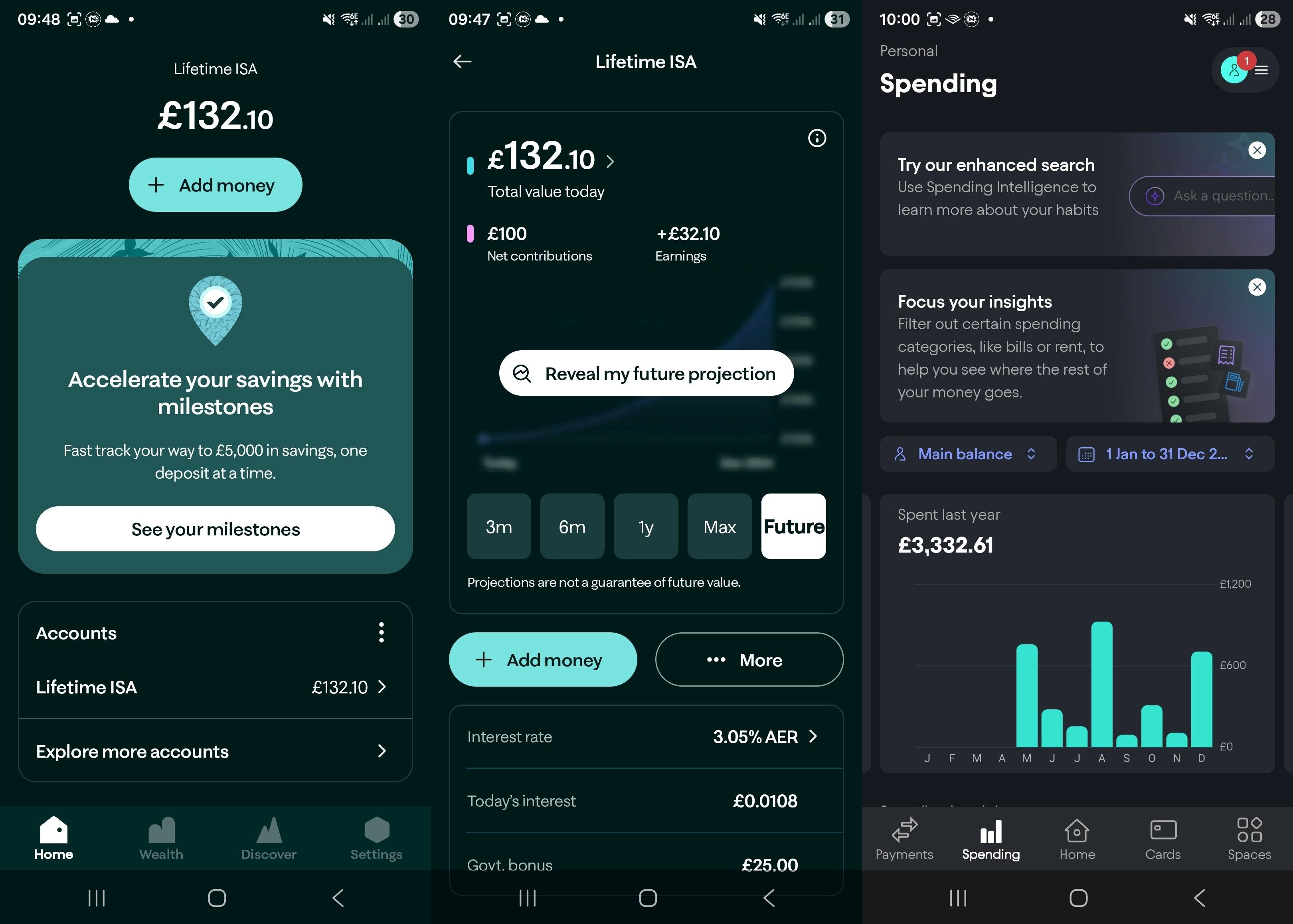
2) Adaptive Themes and the Maturing of Dark Mode
Dark mode is not just a trend anymore, it’s an expectation. Modern users assume that apps will respect their system’s dark mode settings, automatically switching to reduce glare and improve readability in low light, and overall adjust to an experience that’s easier on the eyes.
2026’s design standards go beyond a simple dark mode toggle. Both Apple and Android now offer more flexibility through adaptive and dynamic themes, giving apps the ability to feel more personal and context aware.
- An adaptive theme mirrors the user’s environment; inheriting colours from wallpapers, system accents, and even accessibility preferences.
- A dynamic theme, on the other hand, shifts tone throughout the day; brighter in the morning, softer in the evening, aligning visual design with natural circadian rhythms.
Modern banks are already embracing darker, adaptive designs to support digital wellness and reduce blue light exposure, offering the users a calmer and more human-centred experience. Apps that ignore this trend risk feeling outdated and out of touch with users’ evolving expectations.
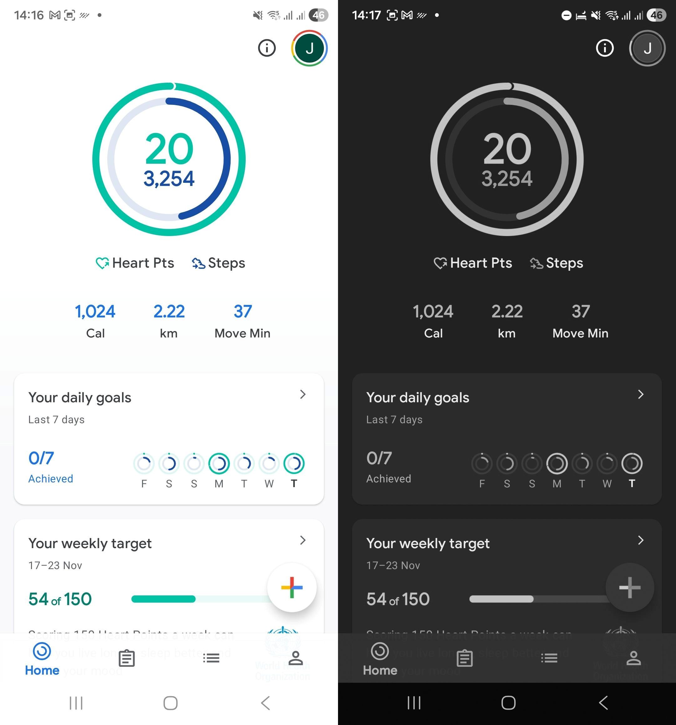
Screenshots of the Adaptive and Dark mode settings on Android including modes like ‘sleep’, where the user can set grayscale and dark mode, for specific times of the day or turn it on/off manually.
3) Grouped Actions and the Rise of Split Buttons
Interfaces are becoming more intentional about reducing clutter. One emerging pattern is the use of grouped or split buttons that consolidate related actions into a single touchpoint.
Dynamic buttons reveal additional options only when needed—expanding, morphing, or spinning into view. Connected buttons group related actions side by side and visually react to each other when one is selected.
Split buttons take this a step further by prioritising one primary action while keeping secondary actions tucked into an attached menu. This offers flexibility without overloading the interface, helping users focus on the most important task first.
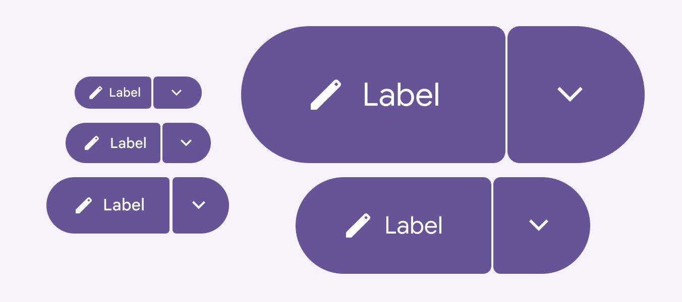
Split buttons from the Material 3 Expressive Library (Source)
4) Floating Action Buttons (FABs)
Floating Action Buttons (FABs) highlight the primary action on a screen, and they float above content, persisting on the screen. FABs help users quickly access the most important feature, whether it’s composing a message, adding a task or making a payment. Whilst it’s not a new concept on Android, it is part of the latest iOS update, making it available for Apple users.
Variations of this floating element, can include text labels alongside icons, transform into mini menus, anchoring at the bottom of the screen, aiming to provide an accessible experience.
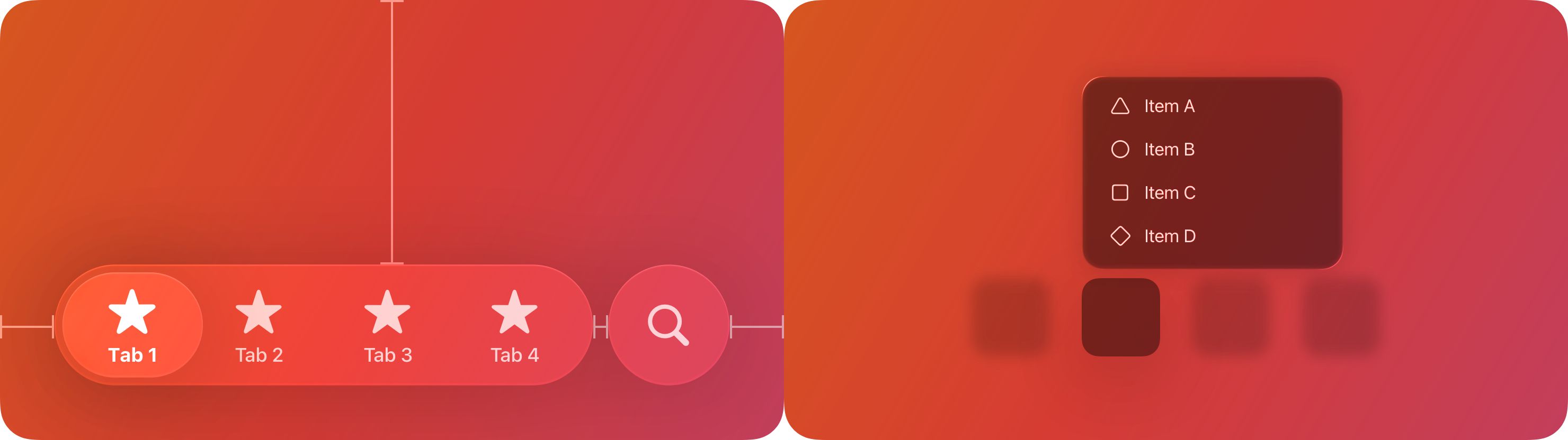
Floating action buttons (FABs) example from the Material 3 Expressive & IOS 26 Libraries (Sources: FABs, Menus)
5) Morphing Shapes and More Expressive Motion
Motion is evolving from decoration to a core interaction language. In 2026, morphing shapes and transforming buttons are becoming standard, giving users a sense of continuity as elements fluidly shift from one state to another.
At the heart of this lies the motion physics system, a physics-based framework that simulates realistic movement, adding bounce, elasticity, and natural pacing to interactions. Subtle bouncing or spring-like motion creates liveliness and personality, making interfaces feel responsive and tactile rather than mechanical.
The rounded corners of elements, where curves align around a common centre, are a deliberate step toward a more concentric and cohesive design ecosystem. This geometry allows shapes to adapt and evolve without losing consistency. Also enabling smoother, more fluid transitions between components and states.
Morphing shapes examples from the Material 3 Expressive Library (Source)
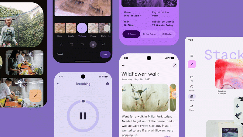
6) Hero Moments
Large static hero banners are giving way to “hero moments”—small, intentional bursts of focus that highlight key messages or actions without dominating the layout.
These moments are dynamic, contextual, and often animated. They deliver a clear message or call to action with precision, adapting to the user’s journey rather than serving as a one-size-fits-all visual anchor.
Hero moments take up less space while delivering significantly more impact, helping interfaces feel fresh and relevant without overwhelming users.
Screenshots of hero moments in Moneybox and Starling
Final thoughts
Business with strong usability and accessibility track records are shifting their attention towards a deeper level of user satisfaction and focussing on how design makes users feel, transforming ordinary app moments into meaningful experiences.
In 2026, the most successful digital products will be those that combine intelligence, adaptability, and emotional clarity to create meaningful moments throughout the user journey.